首页
产品展示
案例展示
资讯
关于
联系
服务热线:
15889453751
首页
产品展示
案例展示
资讯
关于
联系
9
项服务标准
3000
家客户选择
112
项细节标准
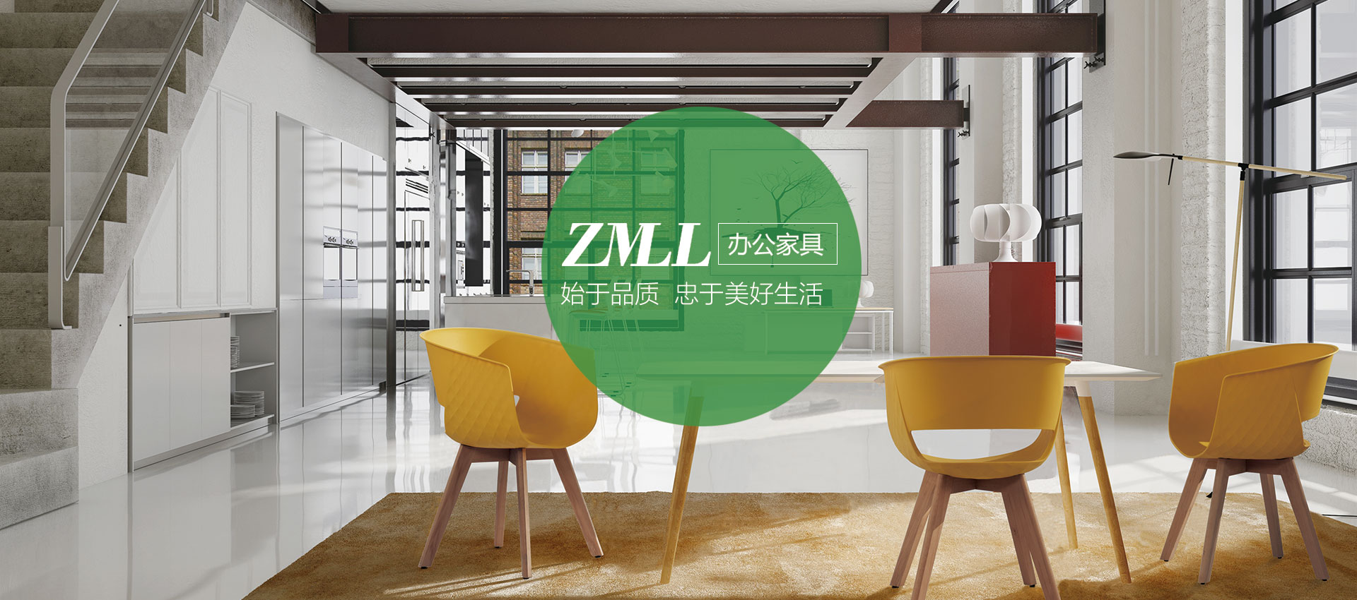
高端办公椅品牌专家
我们以高品质办公椅设计创造商业价值,以创新理念提升品牌影响力
高端定制培训椅
品牌培训椅、专注于用户体验,提升用户舒适度
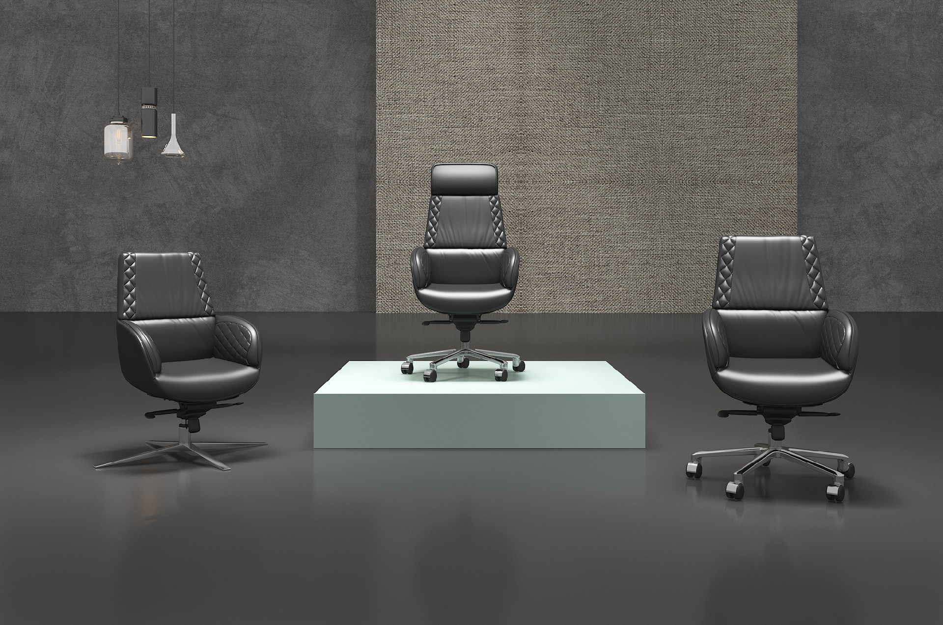
高端定制皮椅
舒适而高端,让您享受办公室里的温馨
高端定制沙发
从客户角度出发,为客户提供满意的沙发体验
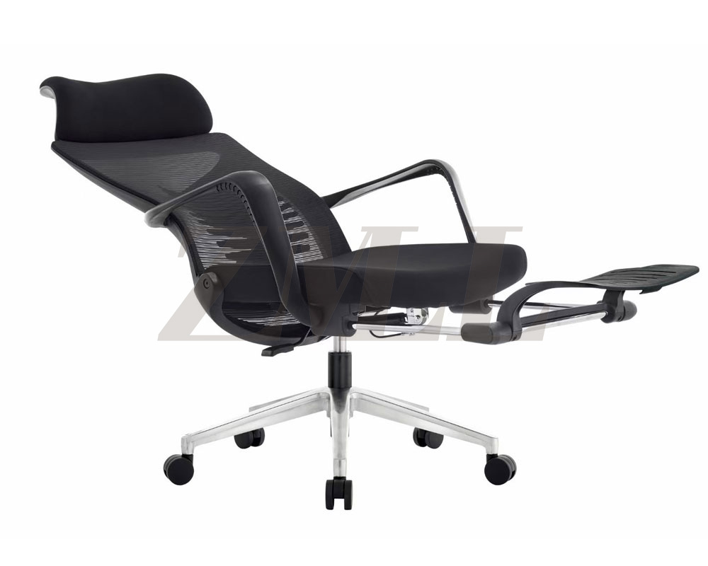
高端定制网椅
适合各类办公用椅,让您高效办公
产品展示
作品详情
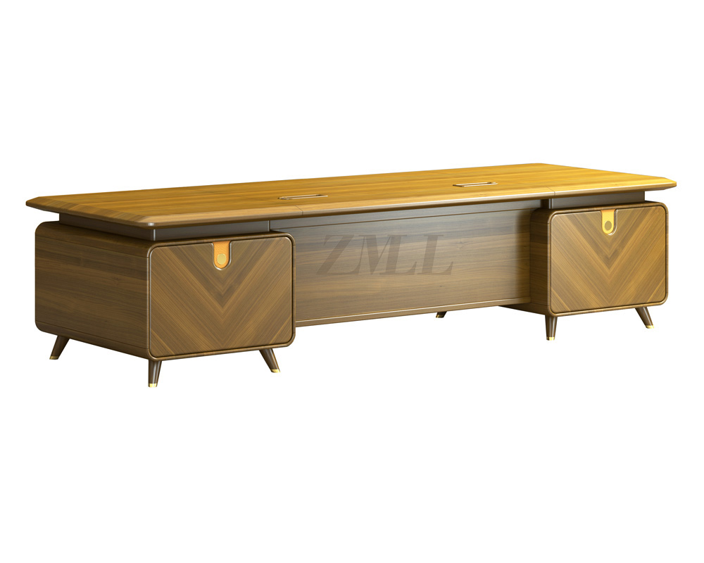
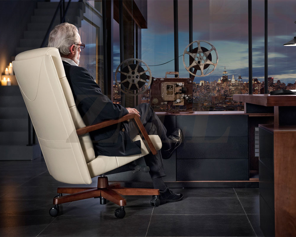
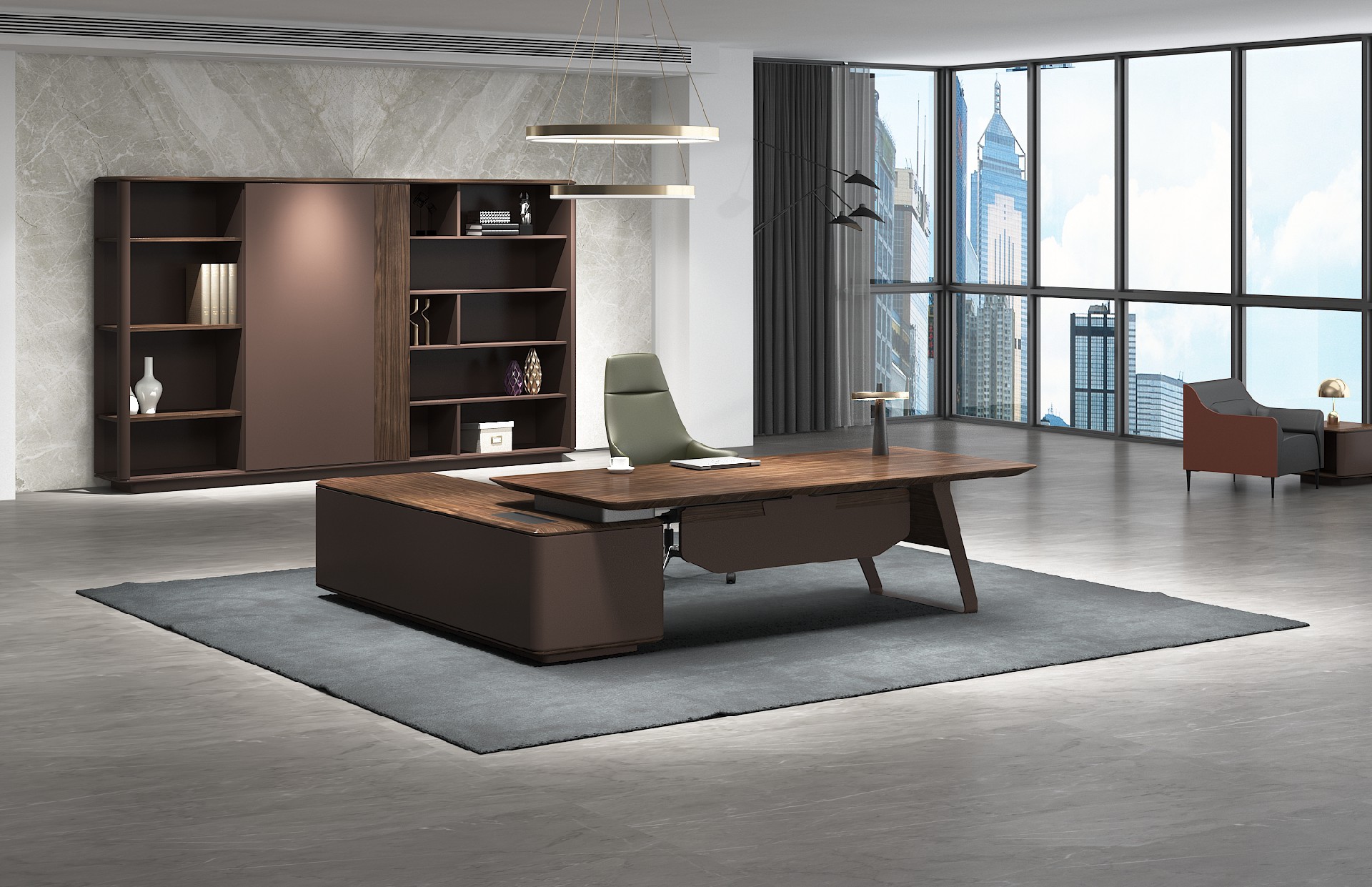
总裁系列
作品详情
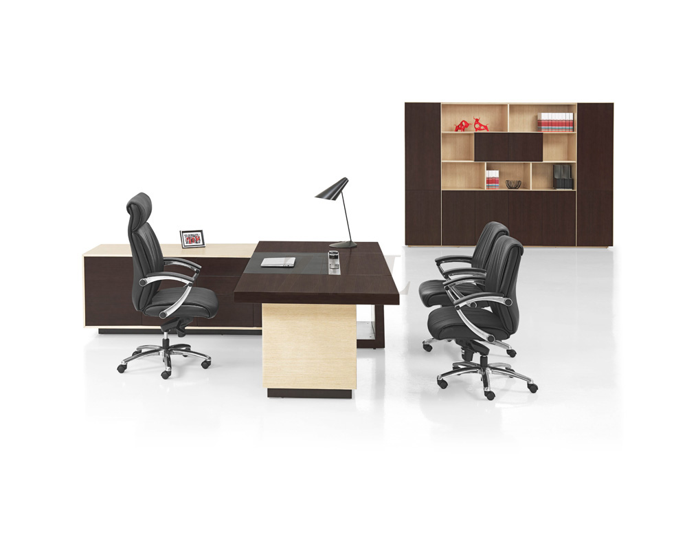
总经理系列
作品详情
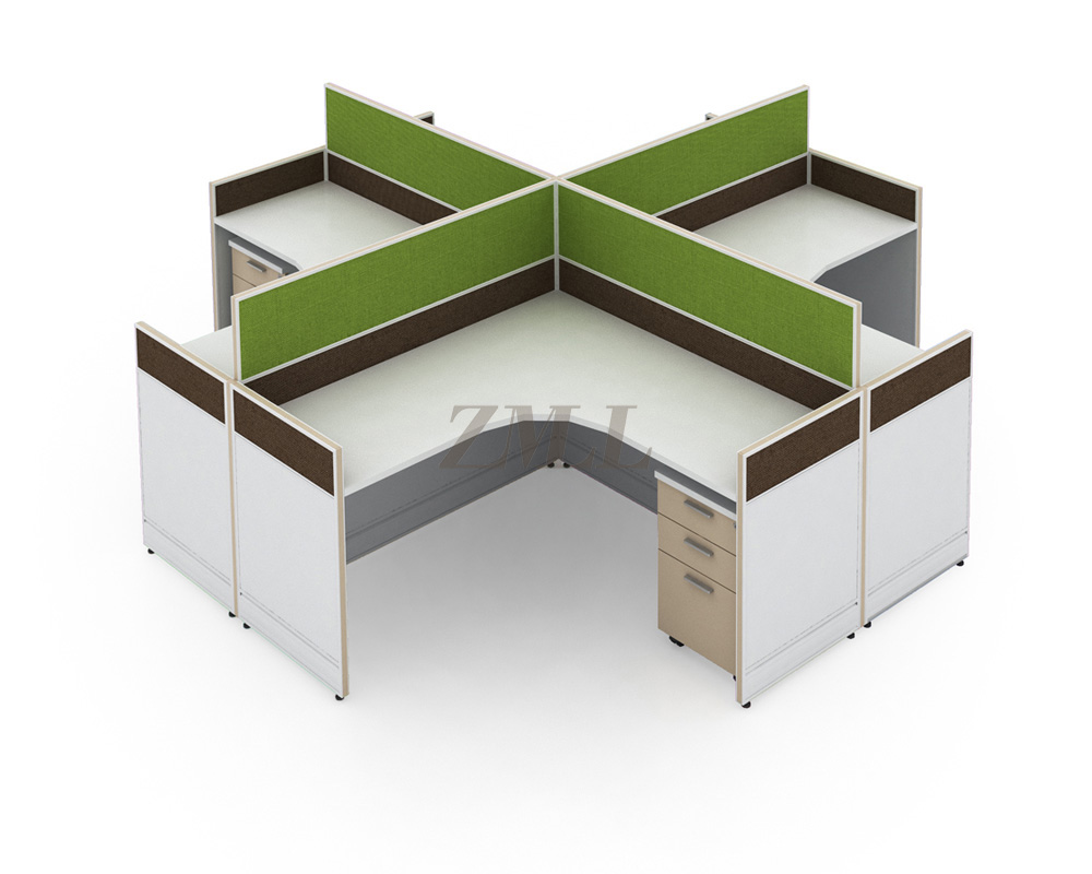
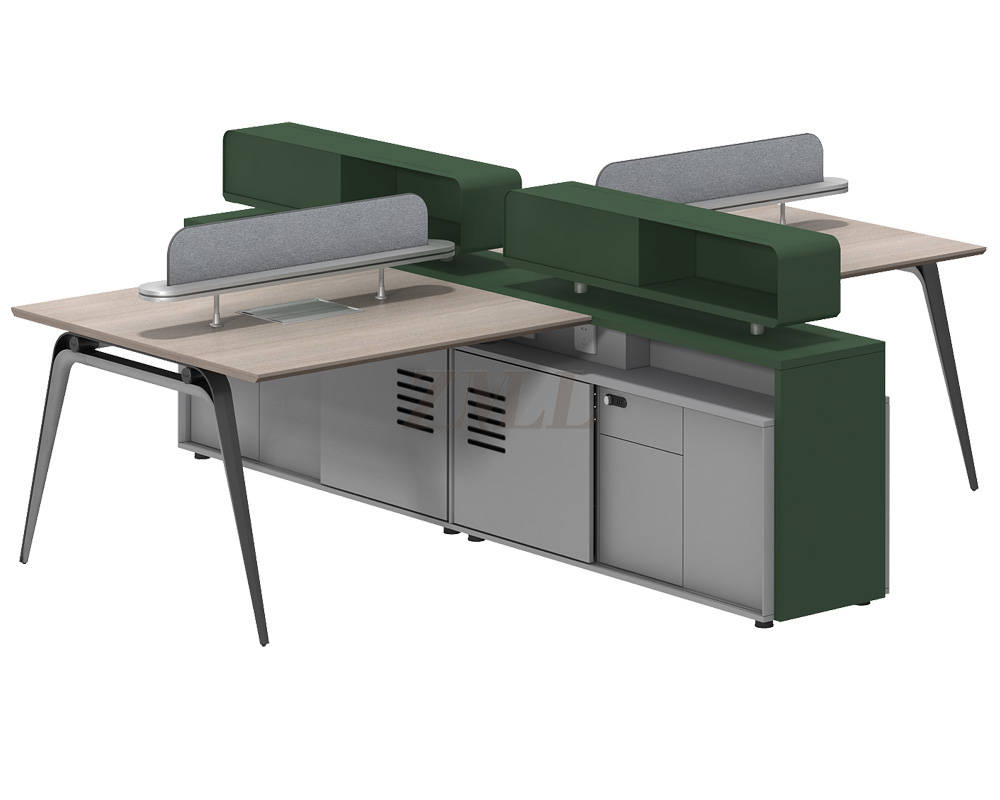
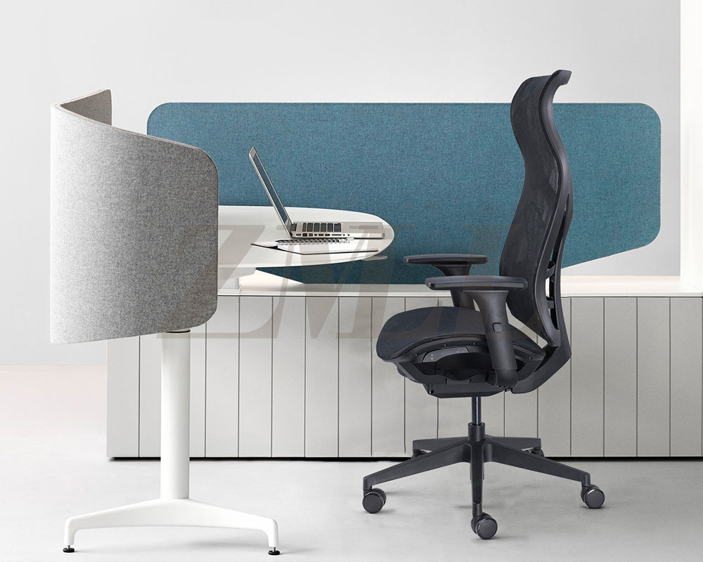
屏风卡座系列
作品详情
会议台系列
作品详情
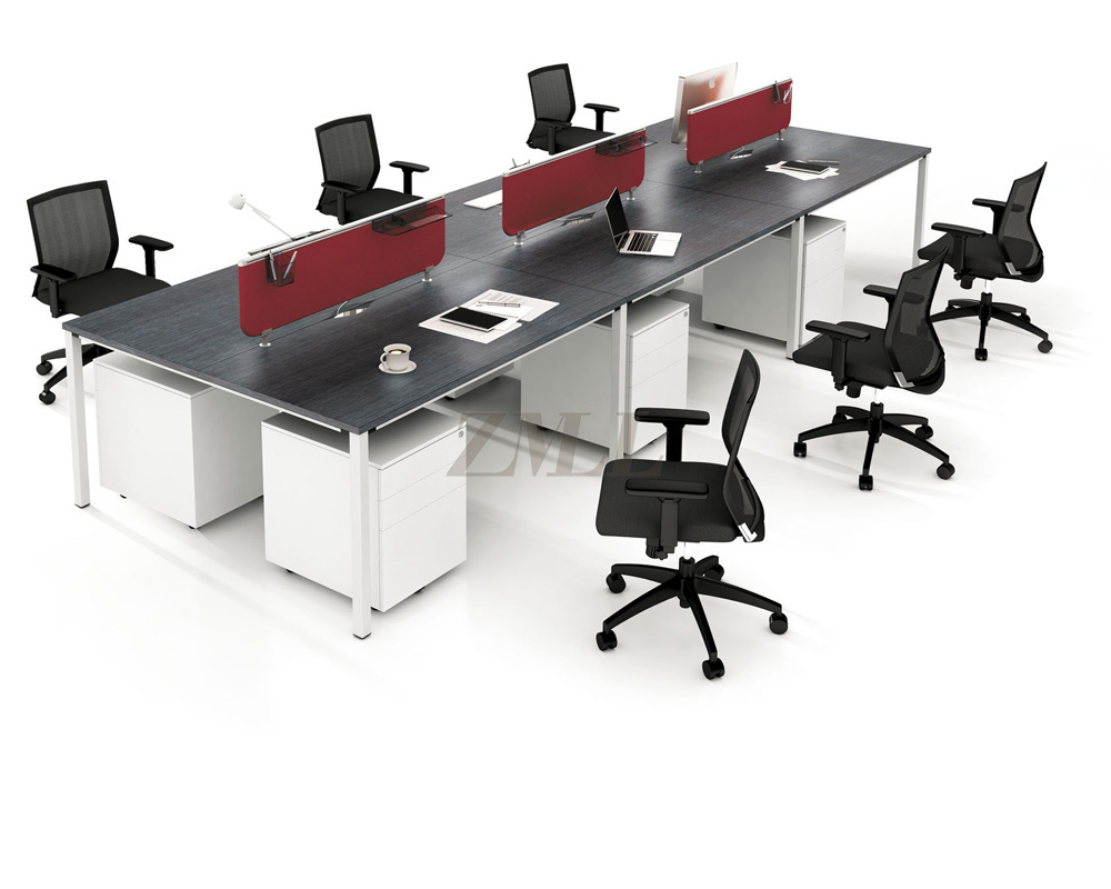
工作站系列
作品详情
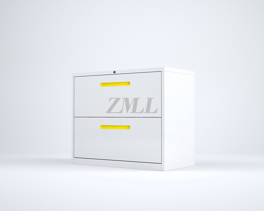
钢制品系列
作品详情
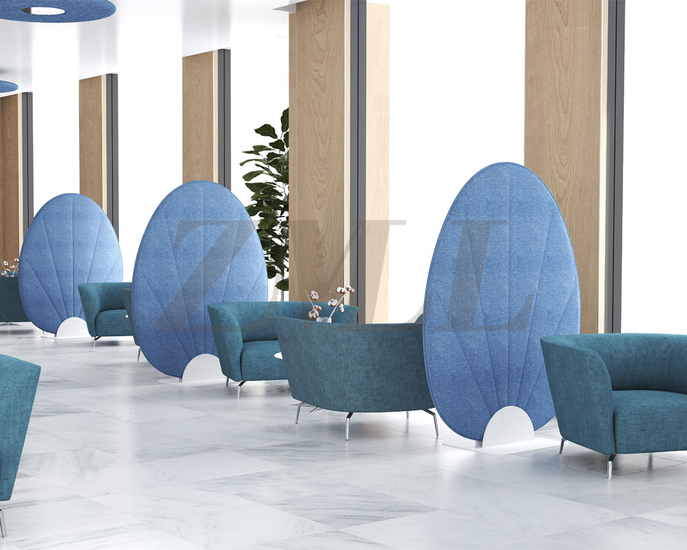
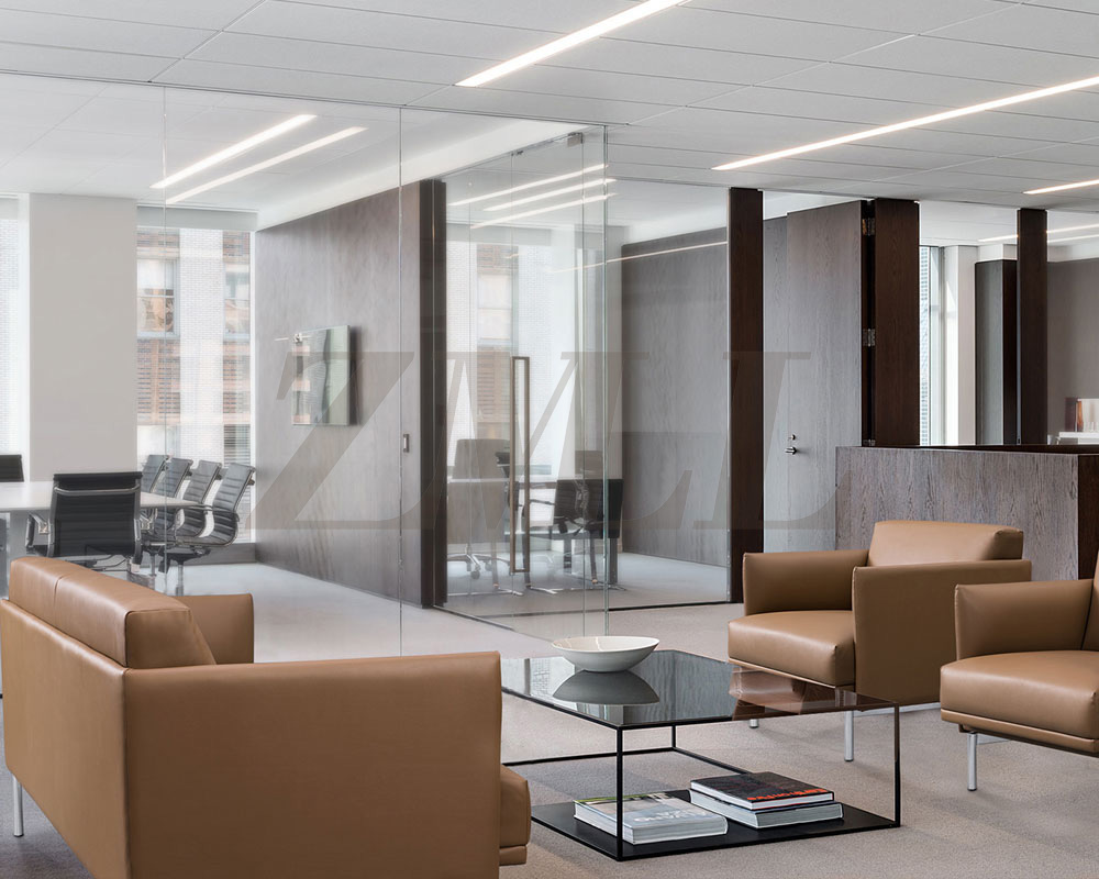
休闲区系列
作品详情
午休椅
作品详情
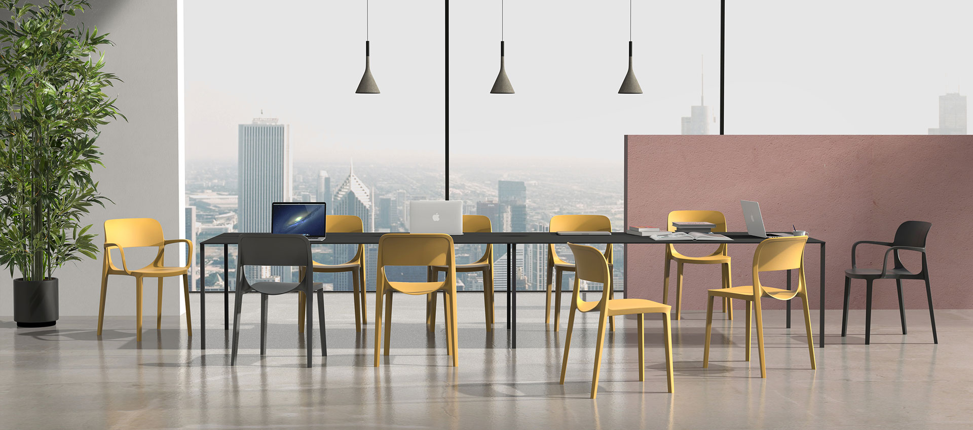
网椅系列
作品详情
沙发系列
作品详情
皮椅系列
作品详情
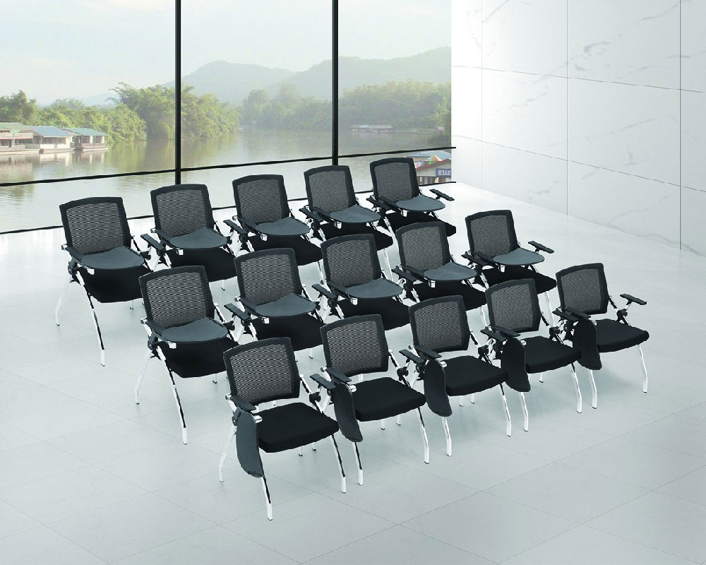
培训椅
MORE
我们服务于******的客户
每一个企业的办公环境,我们都将鼎力相助——舒适创造价值 Brand to create value
资讯
2022-03-30
网布办公椅该如何保养
办公桌和网布办公椅是办公时主要使用的办公家具,无论是会议讨论还是邀请客户访问,都是办公空间不可或缺的···
Load More
2022-03-30
选择办公家具要考虑哪些问题?办公椅厂家来说说
办公椅厂家了解到,办公家具集中采购在四类人群之中:一是公司,二是政府部门,三是高校,四是宾馆饭店。那···
Load More
2022-03-30
如何挑选办公家具?
办公家具一般有5种色调:黑色、灰色、棕色、暗红和素蓝色。通常,不同种类的灰色用于办公桌;黑、棕色用于老···
Load More
2022-03-30
现代办公家具制作的四个构成要素
一个完整意义的办公家具的产生都离不开四个构成要素,这四个要素互相联合的同时又互相制约。本期广州办公家···
Load More
MORE
I NEED TO BUILD WEBSITE
我需要办公椅
*请认真填写需求信息,我们会在24小时内与您取得联系。
微信
个人微信
微信
企业公众号二维码
微信
企业微信二维码
电话
15889453751
QQ
97207354
返回顶部
TOP